Direct-view LED is a fantastic story of concept, evolution, and refinement… but someone needs to tell the tale.
Direct-view LED technology began its story on the biggest stages. Between pixel technology which offered only wide pitches (ergo further away viewers) combined with a cost-of-entry which was prohibitive to many spaces, direct-view technology was only realistically available in arenas, billboards, and certain high-profile spaces. Initial displays had poor power-balancing between their red, green, and blue elements resulting in massive power consumption. Initial dvLED also had limited viewing angles due to the early pixel-shader styles, which created discoloration and loss of image if you looked at a display from an oblique angle.
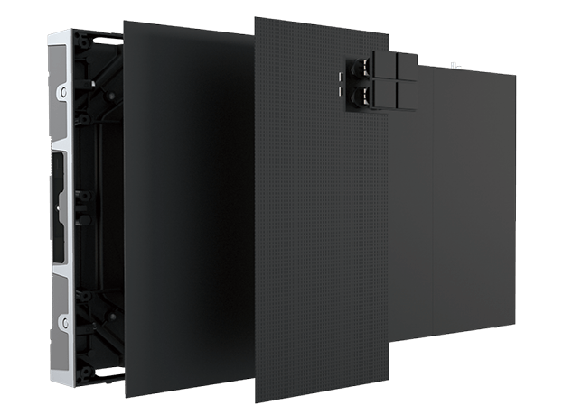
As direct-view technology has refined, so have the needs to implement it. The newest direct-view models boast fine pixel pitches, with robust and ruggedized pixel technology. Displays can run 24/7, while not emitting enough heat to require costly HVAC. Displays are light-weight, often requiring nothing more than a plywood backing for mounting, and a small handful of standard 110V circuits to power. This once mysterious and complex technology is now so modular and stable that many manufacturers now offer mobile cart options which sport full HD resolution, plugging into standard wall outlets.
In order to realize the full benefits which dvLED has over alternative display technologies, the conversation will need to eventually change. Direct-view technology deserves a new narrative from spokes-people familiar with the ease at which a variety of parts can quickly become a beautifully uniform and truly seamless display.
The best avenue to creating these technology evangelists is a simple certification, which can be earned in as little as three days. For many manufacturers, becoming certified requires an understanding of how data and power works with the technology, often including hands-on exercises. There are educational offerings out there to help installers get comfortable with the technology before jumping into a certification course. Almo Pro AV is offering a full dvLED installer education track at each stop of their 2020 E4 Experience. Certification in dvLED can be a powerful tool to becoming an ambassador, telling the story of a technology that does not require extraordinary mounting needs, complicated site-surveys, or extreme power handling capabilities.
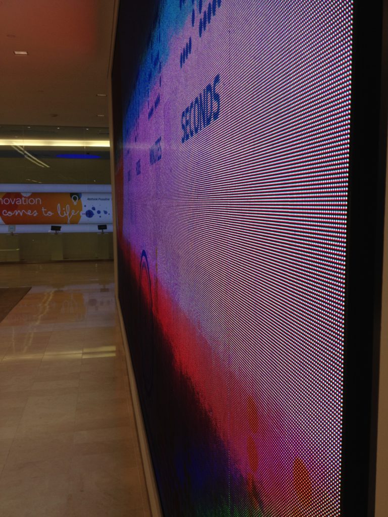
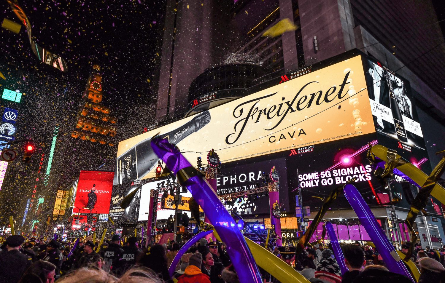
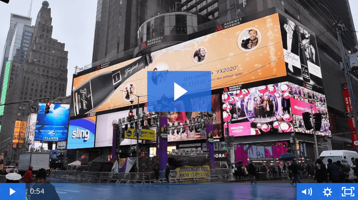
Ringing in the New Year in New York’s Time Square, our mission was to figure out how to get a selfie from your smartphone onto the largest screen in Time Square, in seconds.
Time Square everyday is a jumble of digital screens, showing ads for everything from retail, movies, video games and beverages. Content for most of these screens is created months in advance by advertising agencies, and most of it is static images and videos. Every so often though advertisers are willing to take advantage of the fact that each of these screens can do much more than show simple images or videos. With the right type of content development, these screens can create a one-to-one experience between the advertiser and consumer using social media, real-time games and by posting photos to the screen.
Time Square always has a huge crowd, but it’s biggest night by far is New Year’s Eve for the Ball Drop. Advertisers bring their best for NYE, knowing there will be millions of viewers both in person and watching various broadcasts at home around North America.
Almo Pro AV Content Services teamed up with Diversified Media and Silvercast to deliver a special New Year’s Eve experience for Wilkins Media and their client Freixenet. The brand wanted a way to connect with partiers in Time Square and around the world. Using the largest digital screen in Times Square they encouraged people waiting for the ball drop to text their photo to the screen in real-time.
That’s where Almo Pro AV came in. Our Content Services group does a lot more than make beautiful content – and in this case, we handled programming and data connectivity with all the creative coming from the advertiser.
The big screen showed a special text phone number and keyword which encouraged people to text a selfie to the screen. Once people snapped their photo and texted it to the number, we first had a live moderator verify the people were well behaved. Once approved, the photo went into a data queue to show on the screen and everything from there was automated.
The digital sign wasn’t showing the typical video-based ad, but a real-time generated HTML5 application. This custom built application animated the selfies to appear as if they were a bubble popping out of a Freixenet bottle and allowed for four new selfies to show each time the ad played on the screen.
Selfies create challenges because each one is so unique. Some photos have just one or two people, others have a large group. Some are portrait and others landscape or at strange angles. The creative called for us to show the photos exactly the same for everyone, with the faces all fitting in a tight circular bubble.
With hundreds of photos coming in at the same time, all of the cropping and animation had to be automated. We used facial detection algorithms to best fit the photo on the ad layout and adjust each photo to best fit in the circle. As each photo was texted in and passed our live moderator, we had in some cases just a few seconds to get it in the queue and on the screen.
After each photo passed moderation, we also sent a text back to the viewer. This text alerted them they were being shown on the screen and sent them a small preview image of how they looked in the bubble. This preview creative was different than the big screen, meaning every photo had to be auto cropped and sized twice.
The ad was live in Time Square from 7pm to just after midnight and the big countdown. Once the party was over in New York, the campaign was over. Months of programming work and prep was over in a flash.
Hundreds of partiers sent in photos and the content performed flawlessly thanks to amazing teamwork with Diversified, Silvercast and Wilkins Media. We helped people ring in the New Year in style and they looked great up on the big screen, without knowing about all of the behind the scenes programming and magic that made it happen.
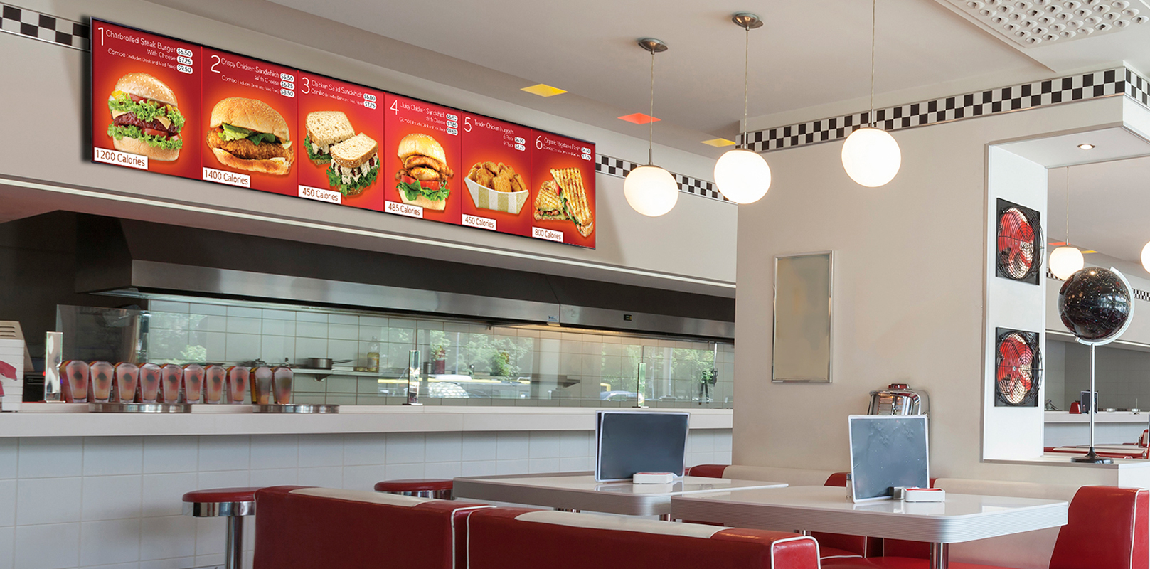
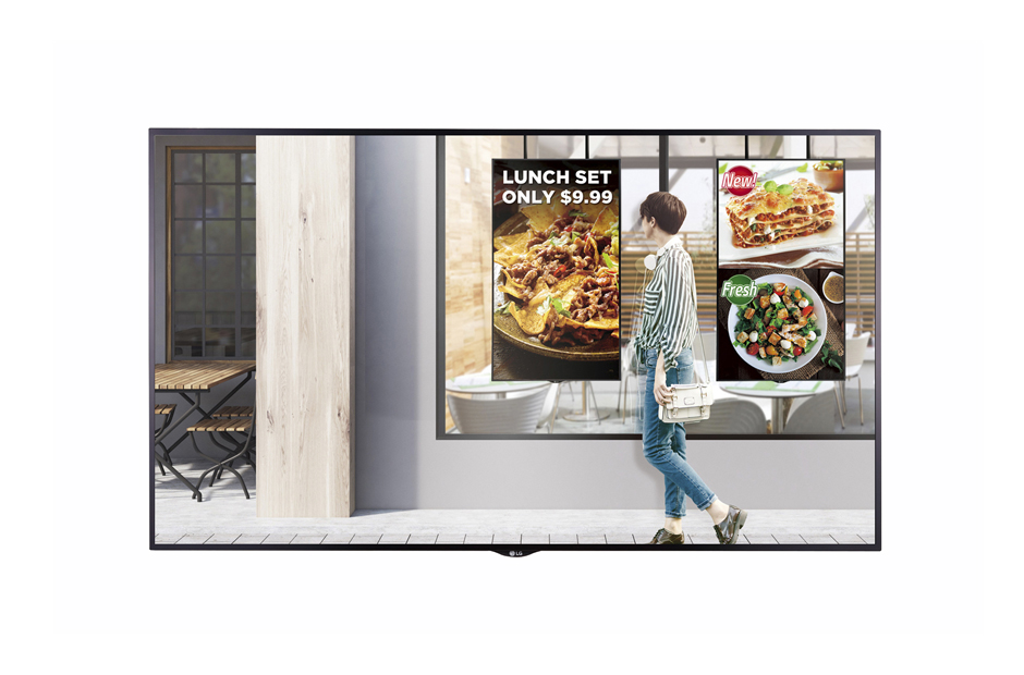
Alan Brawn, an AV industry veteran with experience spanning over 3 decades including management of a Pro AV systems integration company for 7 years, and one of the founding members of Hughes-JVC back in the early 1990s knows something about QSRs and Menu Boards. He is a recognized author for leading AV industry magazines such as Systems Contractor News, AV Technology, Digital Signage Magazine, and Rental & Staging, and we’re excited to share his take on the current state of the industry. Read on to see his latest contribution to Commercial Integrator Magazine, where he did a deep dive with Almo’s own Jim Nista on content creation and what works and what doesn’t.
Integrators should recognize the significant demand for digital menu boards – and then acknowledge there’s a lot to learn to deliver them effectively.
by Alan Brawn
IN THE EVER-EXPANDING REACH of digital signage, retail- and food-related enterprises dominate in market share. Both retail and food services take special advantage of the major benefits of digital signage. They use variations of digital signage communication to enhance the viewing experience, modify viewer behavior, and promote their proprietary calls to action.
The intended consequence of this is to promote customer loyalty and repeat business and show differentiation in a concerted effort to stem the flow of commoditization and the appearance of sameness. Nowhere is this more evident than in quick serve restaurants (QSR) and convenience stores. One of the most popular “go-to” solutions in those niches is the incorporation of digital menu boards.
As with most digital signage, menu boards appear quite simple on the surface. It seems that all you need to do is put up a display and a list of menu items and call that job complete. Well, not so fast. There is much more involved in the area of menu boards than first meets the eye. With the expanding competition in the food industry and especially in quick serve restaurants, this whole menu board “thing” can be an existential issue.
A report by the prepared food industry shows that 60% of restaurants do not make it past the first year and 80% go under in five years. Did you know that the average person makes more than 200 decisions about food every day, many for them unconsciously? Research shows that 74% of customers say an easy to read menu is a top priority and 30% of customers say digital signage influenced an unplanned purchase. Statistics also show viewers spend 30% more time looking at digital signage compared to static signs.
Gauntlet Is Thrown: Maximize Digital Menu Board Experience
We have all seen digital menu boards but what stands out is their varying degree of success. A group of subject matter experts out of the QSR industry estimates that more than 60% of today’s digital menu boards are done wrong. Here are some of the most common mistakes:
Poor design, use of space, and too much information on screen
Poor legibility
Using a monotonous static image
Excessive animation where items disappear before viewer can decide › Text-only menus that are easy to ignore
Looking continuously the same with little attempt at a refresh
Poor salesmanship on best sellers
All this being said, I want to share more about digital menu boards beyond statistics and bullet points. I wanted to explore best practices, so I went to Jim Nista, the senior director of content services for Almo. He is recognized as one of the best of the best in this area and teaches extensively on the topic. Since Nista co-teaches the Digital Content and Media Expert (DCME) certification for the industry it came as no surprise that he said, “It all starts with a content creation strategy.” Of course, if we fail to plan then we plan to fail… but Nista pointed out a key question that sets the tone for what is to come. How often will the content need to be updated? The answer will impact the design, how the content will be created, by whom and in what format, and ultimately the budget.
Depending upon the frequency of updating, Nista suggests, “If there are frequent changes you may want to use an HTML platform like Google Sheets. This is fast and inexpensive but can be limiting in design choices. The other choice is referred to as free form. This utilizes a graphic designer and offers true design flexibility but is more costly. Think of this as a template versus custom graphics consideration.”
Nista notes that where budgets permit, the trend is for free form where menu real estate is not constrained by a grid or a template.
This can provide a unique approach and stand out with consumers, and be more interesting and engaging. Both approaches, templated or free form, can be done in-house or outsourced.
Most often the size of the company, how often the content needs to be updated, and budget will dictate what path to take.
Understanding Digital Menu Board Objectives
The digital menu board should be designed to enhance the viewing experience as well as modify viewer behavior as they respond to a call to action but there are two other objectives that relate directly to QSRs and food services. The content needs to help the viewer decide and make a choice and do so in a more expeditious manner. If done properly this improves customer flow. In sit-down restaurants they call this “turning over the tables more quickly.”
Nista provided his short list of design elements to keep in mind:
Know the viewer and design for them.
Keep it simple; too many items and options end up being confusing.
Legibility is key. Font choice and size determine readability.
Beware of distractions. Focus on what you want the viewer to decide upon.
Too many zones can distract, but doing “specials” can be helpful to the company and the viewer.
If it is a fixed menu don’t scroll or animate. People take time to decide and if the menu scrolls too quickly, then they don’t have that time.
Video if done right can lead the viewer’s eye. It can give subtle clues and help make decisions fast. But if not done right it can be a distraction.
Locate menu boards carefully and be easily visible but avoid impeding traffic flow.
We all know that the retail and restaurant industry is highly competitive, and unless you have a unique selling proposition, chances are you will have trouble standing out from the crowd. The current state of the industry is driving restaurant owners to look for ways to set themselves apart from the fierce competition. Many are implementing digital menu boards, which is a step in the right direction,but as one expert told me, “some of these menu boards suck!”
What we know is that simply upgrading from static menu boards to digital menu boards is not enough on its own. More effort needs to be put into the content strategy and design of these menu boards in order to drive sales, engage with customers, and enhance their in-venue experience. If properly planned, designed, and implemented, digital menu boards can tip the scale in a restaurant’s favor.
ALAN C. BRAWN CTS, ISF, ISF-C, DSCE, DSDE. DCME, is the principal of Brawn Consulting.
To work with Jim’s team on creating content for your QSR and menu board projects reach out to our Content Services Business Development Manager Todd Heberlein today.
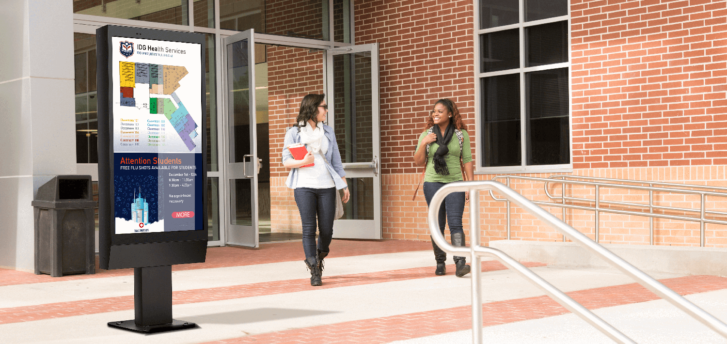
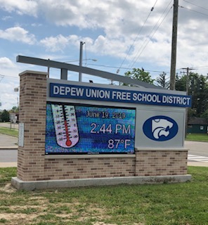
We all want our kids to “survive and thrive.” And like most parents, we all want to be involved in our children’s lives. When is the last time you got “schooled” on LG Outdoor Displays?
LG Outdoor displays provide outstanding visibility with high a great brightness of 2,500 cd.m2. The LG XS Series clearly delivers content and attracts public attention. Isn’t that the ultimate reason for outdoor display visibility?
How many times has this happened to you? You are sitting in your living room and your child exclaims” “Hey guys, I have a band concert tomorrow night” or “Are you coming to my football game Saturday morning” Or my personal favorite “ I need a dress for the school dance in three days.”
More and more schools are turning to outdoor displays to communicate school news and activities. No longer do notifications show up via snail mail. Outdoor signage is not only a more viable solution for them, but for you as well.
The exchange of information is available in high bright technology every time you drive past the school. Now the tables can turn…. “Hey, I saw on the school digital signage you have a football game Friday night.”
What a great selling point to pitch to your resellers. The education season is upon us so what better time to get “schooled” on outdoor signage by LG.
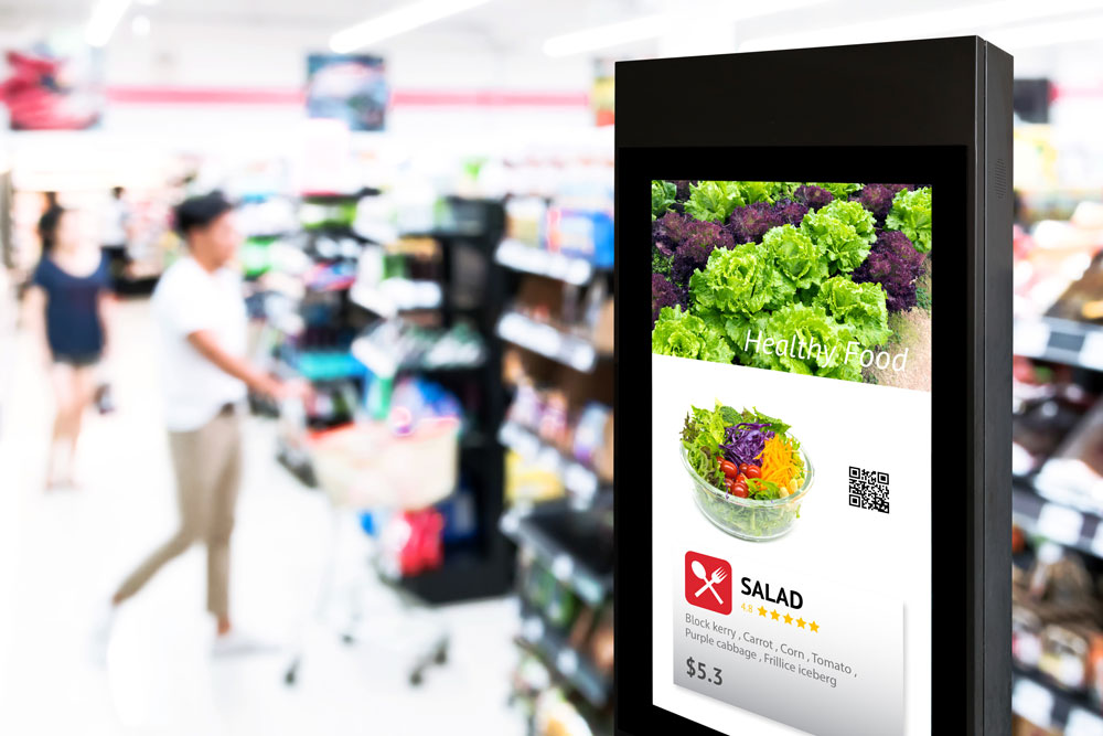
Wherever digital signage is used the goal is the same – to attract attention, engage the audience and get them to take action. Here are a half of dozen guidelines that should have you well on your way to a successful digital signage deployment:
1) Make it Accessible – Place your digital signage at eye level and viewable from different angles so people can get close enough to scan QR codes and read the message comfortably.
2) Enhance Your Appearance – Your signage content is your brand’s face to the world. Make it visually appealing with a simple message, and use moving images and graphics to make it interesting.
3) Keep it Legible – Use an easy-to-read typeface. Bold-face sans-serif fonts such as Arial, Helvetica or Verdana will read easily at a glance if the font is large enough. Test your font size at the distance your signage is most likely to be read. A general rule is one inch of text height for every 10 feet.
4) Cut the Copy – Keep your message as concise as possible. The 3×5 Rule can be effective: limit the amount of text on your display to three lines, each with five words or less, or five lines of three words or less.
5) Keep it Fresh – No matter how eye-catching your content looks, it will eventually go unnoticed out of familiarity. Consider the demographics and the time of day and change content accordingly.
6) Call Viewers to Action – If you want your viewers to do something, make sure your call to action is short and specific. Leave the CTA on the screen the whole time, or show it several times as the content rotates.
One of LG’s most popular series in the XS2E Series – available in various sizes through ALMO.
I was recently asked my opinion on guiding principles for content prepared for close-up viewing versus long distance. My immediate response was that there was a category missing there. The Almo Content Design team looks at viewing distance as three different categories, not two. We design for 3 feet/1 meter for close up viewing screens, such as wayfinders, 10 feet/3 meters on informational screens and greater than that for retail/outdoor.
The “10-Foot Rule” demands legibility and clarity to ensure content at a distance is delivered accurately within the moments it takes for a simple glance. When my team works on informational screens such as menu boards or employee communication screens this is an important consideration that will drive font and icon sizing, color contrast and animation principles. We are careful to use timelines instead of cramming the screen with too much at once. In fact, our mantra is “less is always more when it comes to design on informational screens.”
When you’re working on content for touchscreens, design principles follow mobile app design guidelines. Consistency within the overall user interface (UI) becomes extremely important. Every day we all interact with a touch screen UI that breaks consistency rules. For example, an ATM where the “OK” button changes location from prompt to prompt not only confuses the viewer, it slows the interaction.
For larger screens, especially outdoor, the rule tightens. The message must be legible, of course, but more importantly it must be concise. The “5-Second Rule” isn’t really five seconds anymore – it’s less. Color, contrast and concise messaging become key.
Do you have any “rules” you follow when determining your digital signage designs?
Leave me a comment and let’s start a conversation. And stay tuned for more of my expert advice as I come back each month with a brief thought on a single aspect of digital signage.
We use cookies to ensure that we give you the best experience on our website. If you continue to use this site we will assume that you are happy with it.Ok